About Rey
Reyapp.io is a mobile app builder designed for non-technical founders. Unlike traditional no-code tools, Rey lets you build your backend without writing a single line of code — and publish directly to the App Store and Play Store.
Outline
After my first attempt at shipping with Cursor, I realized that writing code is only part of the process — making real decisions is just as important.
So for this next step, I focused on testing an end-to-end process through a small but actionable task: turning real customer feedback into scoped tickets, implementing the fix myself, and shipping without hand-offs. It wasn’t a big feature or a major redesign — just a chance to sharpen my workflow.
Collecting customer feedback
We onboard each customer individually rather than opening access to everyone on the waitlist. This allows us to offer hands-on guidance and stay closely aligned with our paid customers.
Each week, we meet customers over video calls to review blockers, demo new features, and explore emerging use cases that could shape our roadmap. During these sessions, I actively gather feedback and take structured notes using Granola.
After each call, I review the notes and break down every piece of feedback into actionable tickets. My criteria are:
- I can own the ticket end-to-end
- The logic has low dependency on other parts of the system
- It’s not a major blocker, but it impacts the final customer-facing app
Prioritizing the ticket
All feedback-driven tickets are managed in our UX Improvement database in Notion. I review and share them weekly during our internal sync meetings.
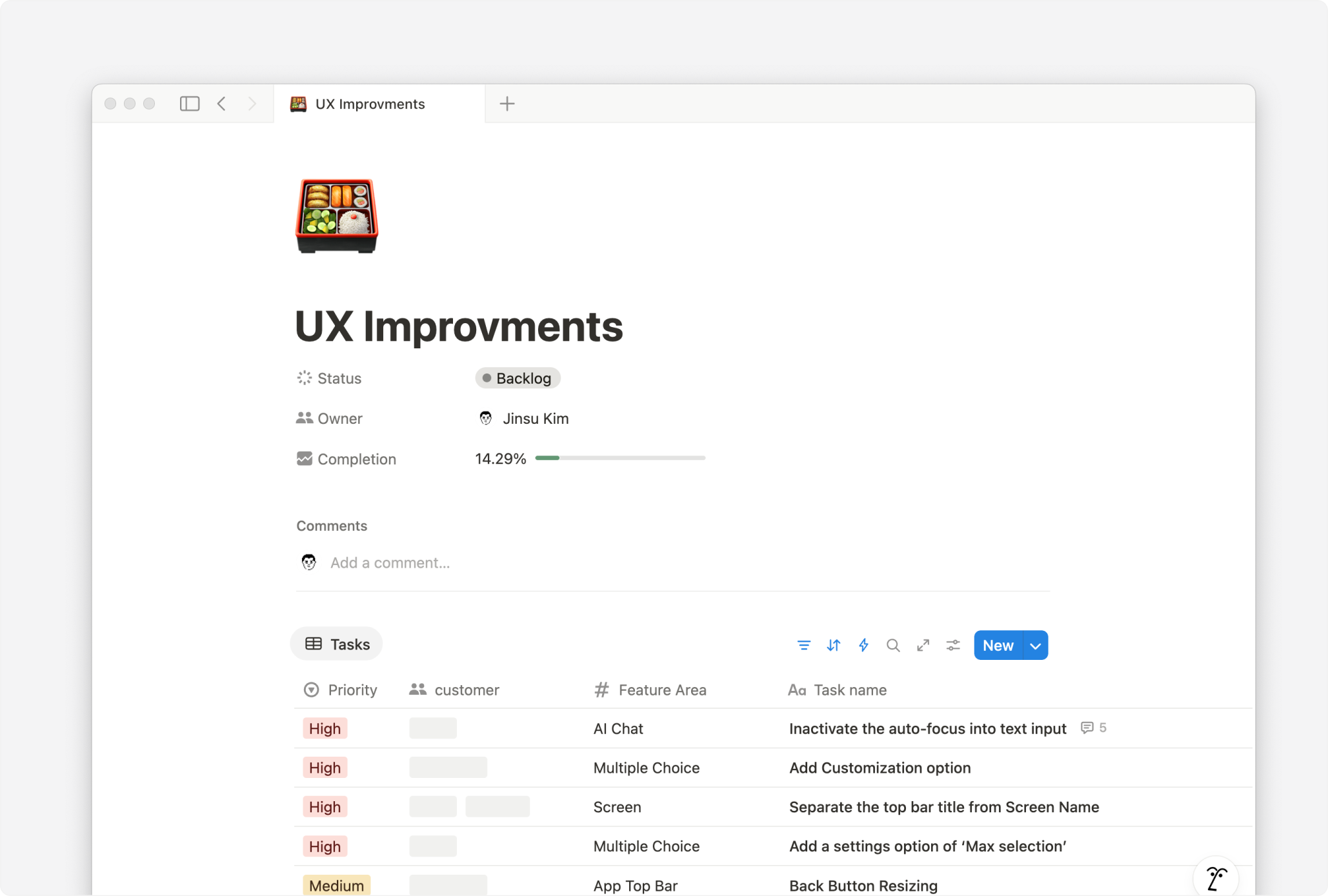
To focus our efforts on the most impactful issues, I highlight which customers are affected and propose a brief solution direction. Sharing early helps validate ideas, clarify intent, and prioritize the right tickets — even before implementation begins.
Example Ticket: Top Bar Title
As an example, there is one ticket that is commonly discussed for every customer.
The Problem
In Rey’s app builder, every screen has a name. This name is mainly used internally — for organizing screens, setting up navigation, or identifying the starting screen.
But the same name also appeared at the top of the app screen, making internal logic unintentionally visible to end users.
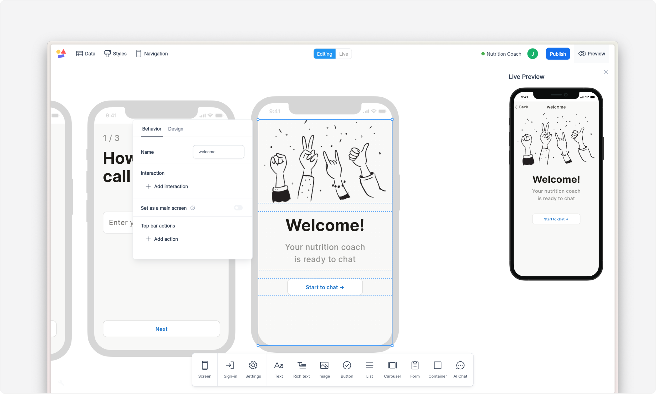
As a result, many customers deleted screen names just to hide them. This made it difficult to organize and maintain their project, especially when screen labels disappeared from the builder.
The Solution
I added a new field called Top Bar Title and grouped it with other related top bar settings.
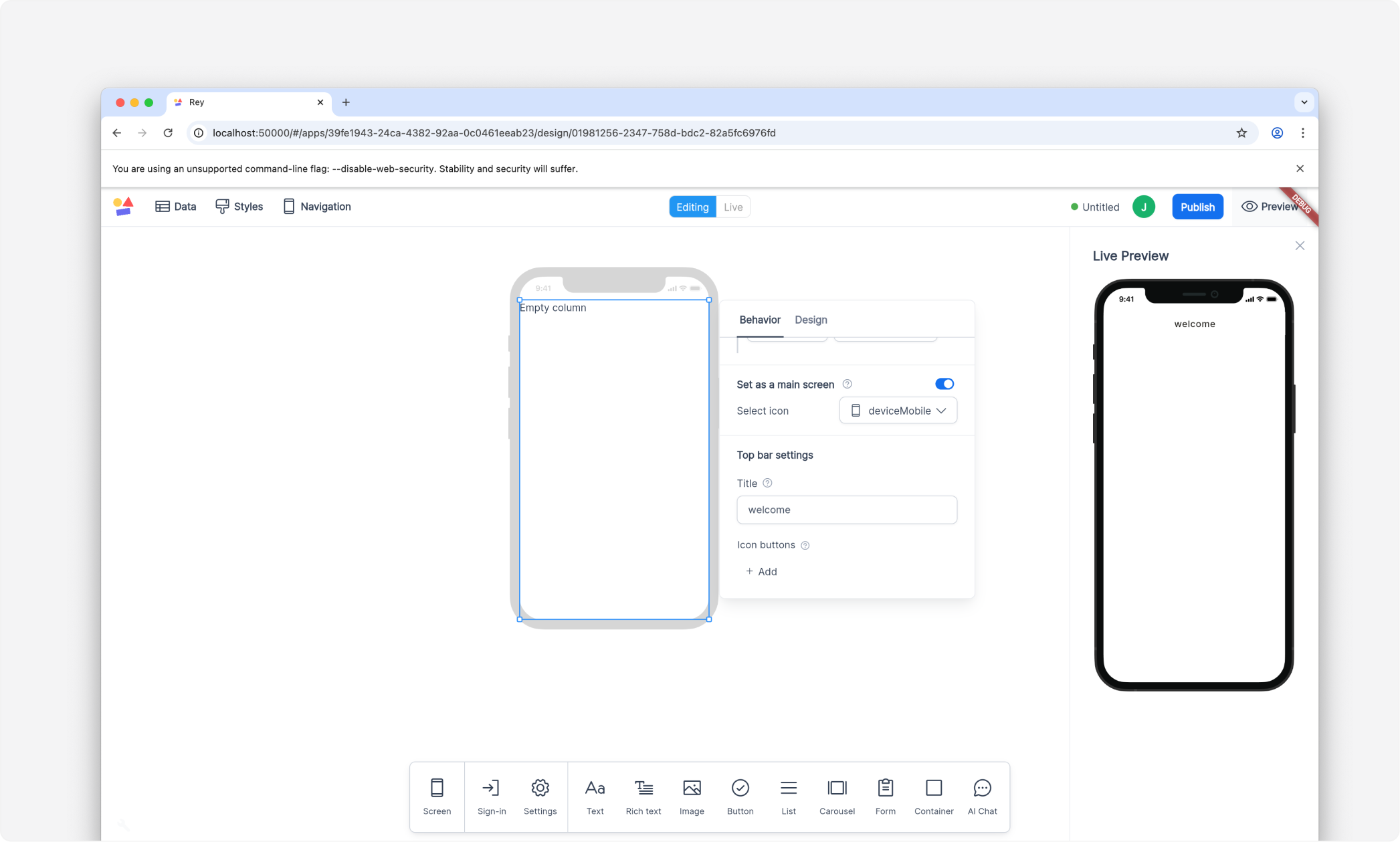
Now, customers can separate what they see in the builder from what end users see in the app:
- Screen Name → used for internal organization and navigation logic
- Top Bar Title → used for display inside the app UI
This small change restored clarity and gave customers more control over their app’s appearance — without disrupting existing logic.
What I learned
Originally, I considered a broader refactor to fully separate the screen name, navigation label, and top bar title. But I chose a lighter-weight solution because:
- These elements are still logically tied together (especially the bottom tab label), and changing that would require larger coordination.
- Most customers don’t expect full top bar customization yet — so the smaller fix was enough to unblock them.
More importantly, I learned that:
Once I start building, it’s easy to slip into deeper layers of logic and craftsmanship — especially in code, where it’s harder to zoom out than in Figma.
That’s why maintaining structure and staying focused on scope is so important when designing through code.
What’s next?
As I continue refining this end-to-end approach, I’ll keep improving how I work:
- Check dependencies at a deeper level.
- Break work down further, and validate more frequently
- Zoom out intentionally